A Hubspot website
Our challenge was to design and develop a website in Hubspot for one of the largest information technology and data center companies in Central America and Spain (as well as its own marketplace).
Our client already had a website online and we worked with it as a starting point. It was a website full of information scattered over many sections and with a large number of pages that made the content inaccessible to its target audience.
We had one big factor in our favor: the client’s exceptional marketing team. They clearly conveyed to us all the goals they wanted to achieve with the new website, and they communicated well the vision of what their managers wanted to see as the end result.
Content analysis and UX • Information Architecture
The first step was to analyze all the material that the client had in hands, sort it to start the project, and match the new user interface to the content that had already been defined by their internal team.
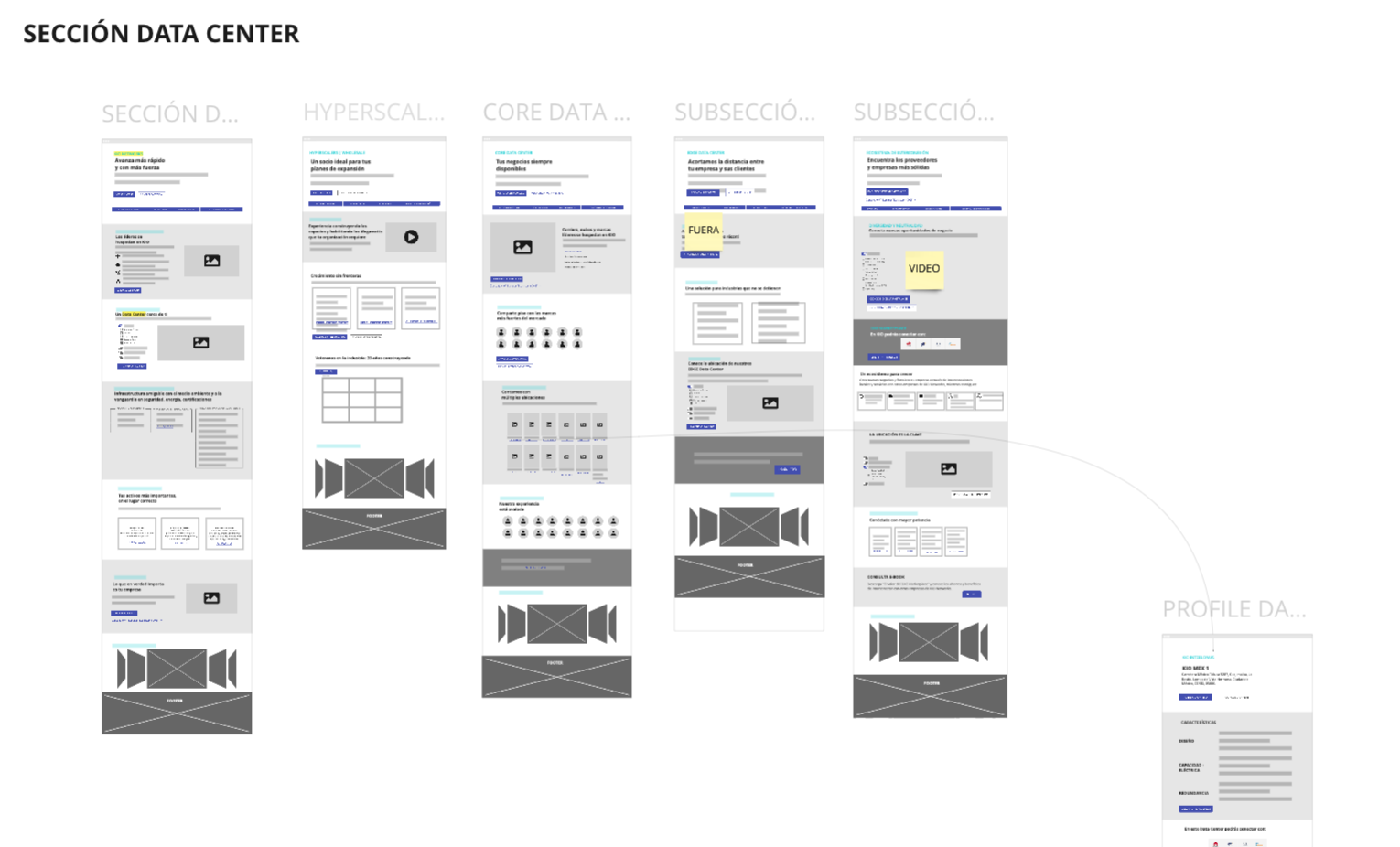
1. Client wireframes
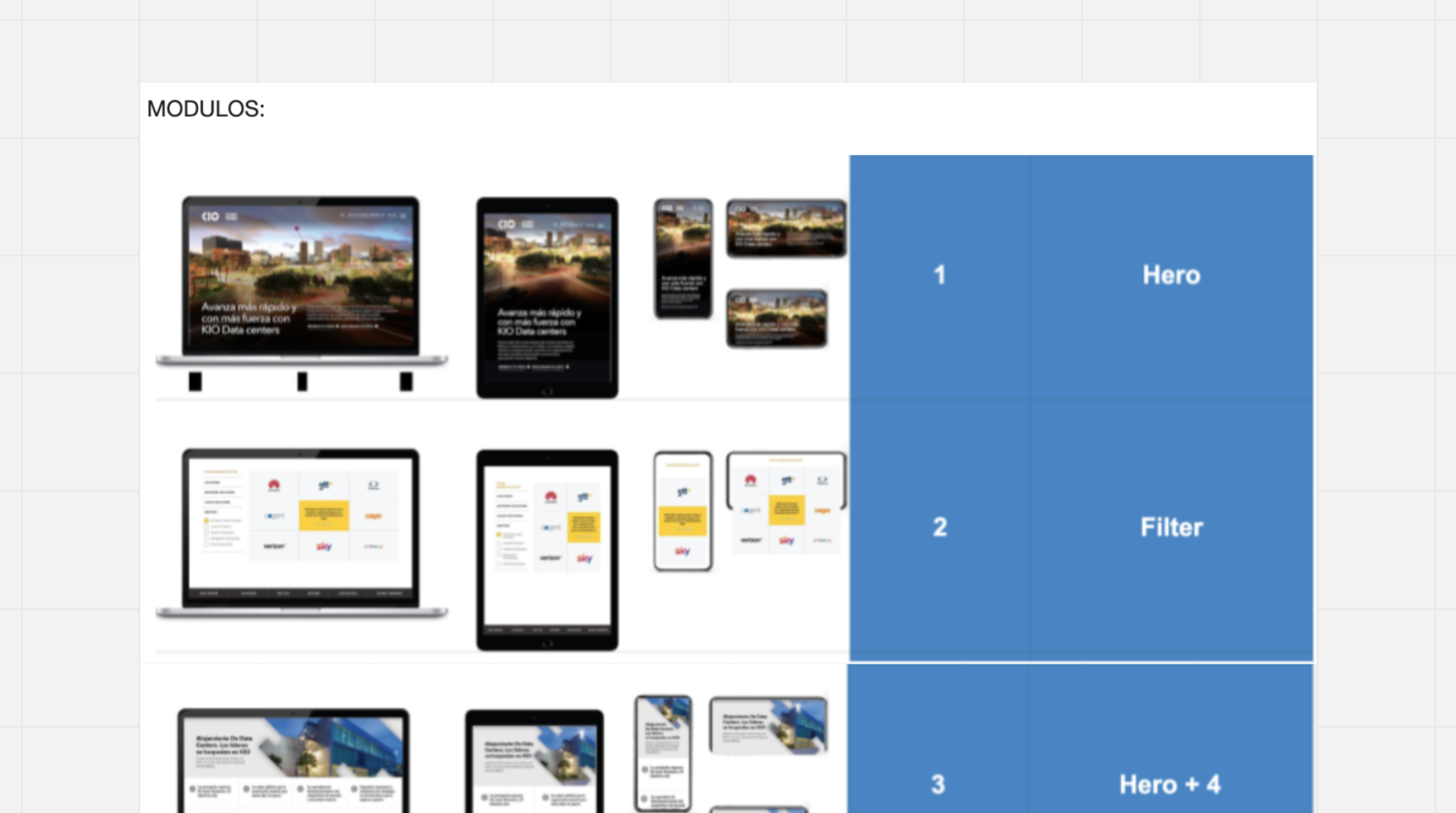
2. Pre-developed modules in the client’s Hubspot
Initial sitemap:
Homepage
5 business units
- Data Center (6 pages, 11 adaptations and interactive map)
- Cloud (2 pages, 17 adaptations)
- Cybersecurity (2 pages)
- Managed Services (5 pages)
- Application Management (4 pages)
Marketplace (3 pages, 19 adaptations)
Resources
- Blog (general page, article view and downloadable view)
- Events (webinar repository, general page and internal pages)
- Podcast Repository (general page that connects to the podcasts)
- Success Stories (general and internal pages)
About us
Careers
Partners
Press
Notice of Privacy. Terms and Conditions, Code of Ethics (downloadable PDFs)
The work done between the business•config UX&UI design team and the client’s marketing team was extremely collaborative, and both teams were quite cohesive.
In less than a couple of weeks we were working as a single team: good communication, and mainly, understanding between both parties about the existing limitations of the web platform to support the creative ideas of animations and visual effects (look&feel) that the company directors sought to accomplish in a very short period of time.
To get the new website online in less than a month, it was necessary for our UX team to summarize the main content prepared for the final website and add viable solutions to make the launch within the established deadline.
Viable solution for short-term web launch • MVP
To get the website online within one month, hard work was carried out in which the content of a website with around 90 pages was summarized for an MVP (Minimum Viable Product). That is, we had to redo the sitemap, as well as the original information architecture of the website to adapt the content to a smaller website, with 10 to 15 pages, and thus be able to design and develop it, all in one month.
Despite the problems that arose, the MVP website was finally launched with great satisfaction from the client, since they could see the effort and dedication of our team to launch a good MVP with a very tight deadline.
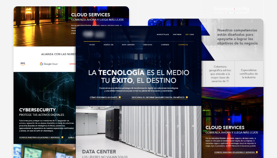
3. Home Page – MVP
Final user interface • UI redesign
Once the MVP was online generating new leads for our client, the business•config team worked at the same time to improve the look&feel of the website in general – so that its final version would include the effects of transitions between the sections and the new graphic elements that would be added to the MVP website.
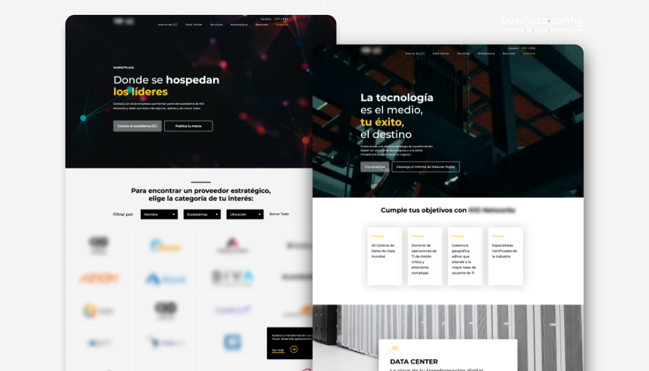
The end result was a considerable upgrade of the website in Hubspot of one of the largest Data Center and IT companies in Central America and Spain.
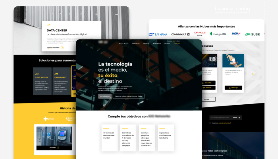
4. Website home page (on April 20, 2022)
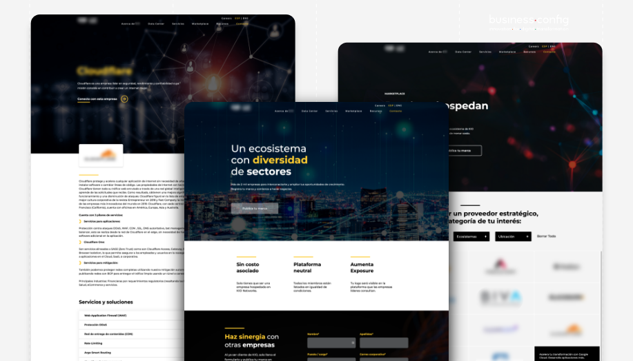
5. Pages related to the marketplace (on April 20, 2022)
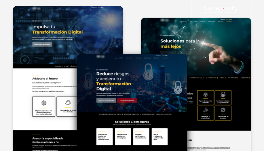
6. Pages related to customer services (on April 20, 2022)
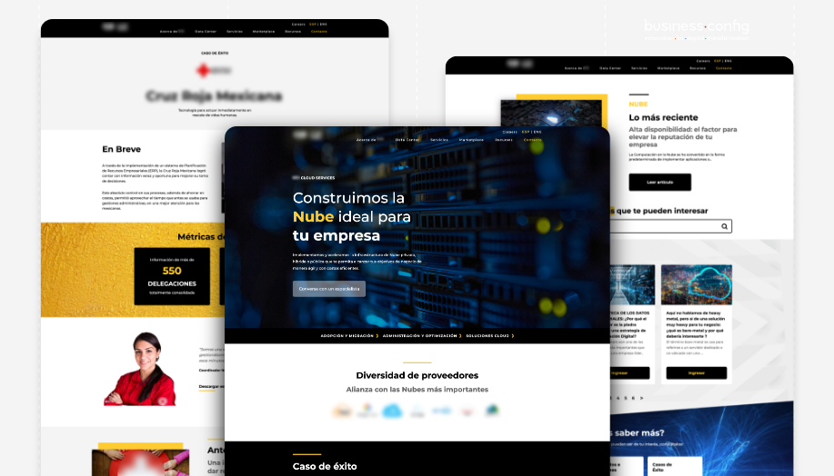
7. Pages related to services and resources (on April 20, 2022)
If this type of solution makes sense for your company, we can help you achieve the results you are looking for and ensure that our team is ready to work with new challenges. Contact us!
